Wednesday, February 27, 2013

Let's Scrap 2-27-13

Hi all!
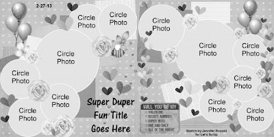
Today is the release for this week's sketch from Let's Scrap. One of the things that I enjoy about being on the DT is the challenge of having to use a particular sketch. Sometimes they are easy to use and others a lot of thought and trial and error comes in to play. This week's sketch was the latter. I must have printed my pictures 3 times in different sizes and colors and switched my paper around twice that many times before I found a combination I liked.

Let's Scrap 2-27-13


I really liked the cluster of photos and all of the embellies on this sketch. As soon as I saw it I knew that this sketch would be perfect for a bath layout. I had envisioned round photos that looked like floating bubbles with lots of cute rubber duckies. After playing around with different materials this is what I came up with.


I started with a sheet of patterned paper that is baby blue with white Polk-a-dots. Then I layered a piece of pale yellow card stock on top of that. Even though I used rectangular photos I still tried to get the cluster effect from the sketch. I liked the way the black and white photos looked against the yellow background. I used blue chalk to give the circles color and make them look like bubbles. Finally I finished off the layout by adding the ducky stickers. I felt like it was still missing something so I added 2 strips of white ribbon with a piece of cream in between, along the top of the page.

Thanks for taking a look. I hope to see your take on this fun sketch in the Let's Scrap Gallery this week!

Thursday, February 14, 2013

Valentines Day Card - the not so sweet version

Hello fellow crafters,

I'm so excited to share my latest creation with you! I made a card for my Sweetie yesterday. He really isn't the romantic type so your average Valentines Day card just wouldn't work. I went for a laugh and a bit of vulgarity.

Front of the Card
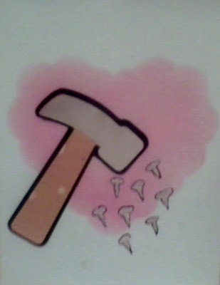
I used a  heart shaped stencil and applied red chalk with a cotton ball. It gave the heart a soft airy feel. The hammer I cut out using the "Boys will be Boys" cricut cartridge. The nails I hand drew using a silver pen and then outlined using a black marker.

Inside of the card
I embossed the edges with a circle pattern then used a cotton ball and blue chalk to color around the boarder. The font is also from the cartridge. My sweetie laughed and shook his head at me :) Overall I think he liked it as much as his heart shaped french toast. Happy Valentines Day!

Wednesday, February 13, 2013

Let's Scrap 2-13-13, Our Lil Artist

Let's Scrap has another great sketch this week. I have been waiting to find the right sketch to scrap some pictures of the Tiny Human and his various painting adventures. The kid loves to paint and color. And this one is perfect.
 
 
Here is my take on the sketch. I switched up the number of strips from 8 to 7 to fit the rainbow color scheme. The block of paper under the pictures is actually a piece cut from one of the Tiny Human's projects. I really wanted to incorporate his art into the layout.
 
 
I used crazy cut scissors to create the edge on the black boarder around the middle section. The pictures are matted on white card stock with black inked edges. I colored each strip with crayon then added the corresponding colored card stock to each strip. Then added colored buttons, I didn't have all the colors so  I used a few clear buttons.
 
A close up of the first page.
 
I felt like there was a lot of whit space along the top of the pages so I added multi colored star stickers. I used a fine tip black marker to outline the stars and colored strips. I used the same marker to add stitches along each piece of the colored card stock. I also used a silver pen and added dots to the black boarders.
 
A close up of the second page.


The banner for the title was really easy to make. I took a strip of white card stock and cut the ends to look like a banner. I then folded over each end to to make the middle part stick up. I used red ink to ink around the edges and the ends. I used black ink and stamped the title, "Our Lil Artist". The journal square is a piece of white card stock that I put green, blue and purple stickers on.
Thanks for checking out my latest layout. Don't forget to head on over to Let's Scrap to play along with this weeks sketch and have a chance to win a prize from The Twinery.


Monday, February 11, 2013

First Vinyl Project

I have been "saving" glass jars for awhile now to make future projects. My Sweetie doesn't appreciate my hoarding tendencies but this time it paid off. My mom gave me some vinyl and transfer tape last month. She was hoping that I could figure out how to use it then teach her. Today I finally got brave and tried it out. It took 3 tries before my projects turned out. But hey it was a learning experience so I would call that a success. I created my design using the Cricut Craft room. The cute little bird is from the Create a Critter 2 cartridge and the font is from the Basic Font Cartridge.


Trial #1
With my first try only the first line of the sentiment came out correctly, the second line was a bit damaged during the cutting process. The bird came out great, except the layers got askew because I put them on the jar 1 at a time. It was really difficult to line them up through the transfer tape. I had changed the pressure to medium but forgot to switch the depth to medium so there where parts of my image where the blade cut all the way through the vinyl and the backing.


Try #2
On my second attempt I made the font bold instead of regular. It seemed to really help the letters not rip during cutting. I also adjusted the dial on the blade (depth) to 3 and the pressure to low instead of medium. The adjustments really helped the blade cut only through the vinyl and not the backing. Also on try #2 I assembled the layers of the bird before putting it on the jar. The results were amazing all of layers were even and looked great. The only problem with try #2 was that the letters were put on to close to the top of the jar.

Before I began Try #3 I scrapped off the letters from Try#1 and then carefully peeled off the bird. I cut out the letters again. This time using the correct settings on the Cricut and once again the bold font. After I got the phrase on the transfer tape I carefully added the bird to the tape. I noticed there was a seem on the side of the jar. I used the seem to center the tape on the jar. This time the images were perfectly centered on the jar.

I'm not sure if I will fill the jars with candy or put some glass stones and a candle in them. Either way I have some cute gifts for my sisters.

 Here are some tips for using vinyl.
Tip 1: Try cutting a scrap piece of vinyl first to make sure settings are correct. I used low pressure and medium depth. You want the blade to cut through the vinyl only and not through the paper backing.

Tip 2: If using words use a bold font or one where the letters are wide.

Tip 3: If you are using an image that several layers, Put all of the layers together before putting the image on the surface.

Thanks for checking out today's post. Hopefully my mistakes will be able to help you!
 

Wednesday, February 6, 2013

Cardabilities #67

February has brought on my inner cupid and I have been obsessed with making Valentines Day Cards. The boyfriend keeps inquiring who these cards are for. I just smile and say not him :) He thinks that V-Day is a made up holiday and therefore hates to celebrate it. Maybe that's why I am going over board. So today I would like to share with you my latest creation.

I have been a fan of Sketchabilities for quite sometime now and just discovered they have a sister site dedicated to card sketches. How cool is that? I used this week's sketch from Cardabilities you can find it here.


I started with a blank card in baby pink ( looks white in the picture). I then used the eraser end of a wooden pencil and stamped the red circle boarder. I really like how each circle is as different amount of ink. While the ink was drying I cut out the key, banner and lock using the Victorian Romance Cartridge for the Cricut.

This card has a lot more little details than I usually do and I'm very pleased on how it turned out. I used a fine tip black Sharpie and made stitches around the red outer section of the lock. I also used the Sharpie to outline the lock pieces. The inner brown piece has a bit of a red tint, I used a sponge to apply the ink. It gives a nice texture. The key I uses Studio G gold glitter glue.


For the inside of the card I used the same newspaper print paper from the front, then mounted a reddish brown card stock on top of to add the sentiment. I had to hand write the sentiment as I don't have any Valentines Day sentiment stamps. I hope to play along with future Cardabilities sketches. Thanks for checking out my latest project.

Friday, February 1, 2013

Toilet Paper roll stamps

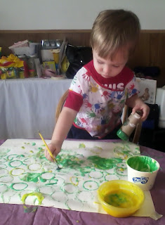
Happy Friday All! The cold weather here is going to be the end of my sanity, Tiny Human has been a little wild since we haven't been able to play outside. Lucky for me he does enjoy art projects, so we made finger paints. If you need a recipe check out this previous post. This time around we used flour instead of corn starch. I like how it gave the paint more of a pastel type color.

I shaped the roll to look like a heart, by making a crease on one side. The rolls quickly got mushy, but that may have been because Tiny Human loves to coat everything in paint.

Here is the final project. Notice the huge glob of paint in the middle.
We also did one using the tubes to make circles. The circles seemed to hold up better than the hearts. I helped a little with this painting, it just looked like to much fun and I couldn't help myself. Tiny Human loves to do things with his mommy so it was ok.

He preferred the paint brush to using his fingers.